Fall Color Schemes: Warm Up Your Space
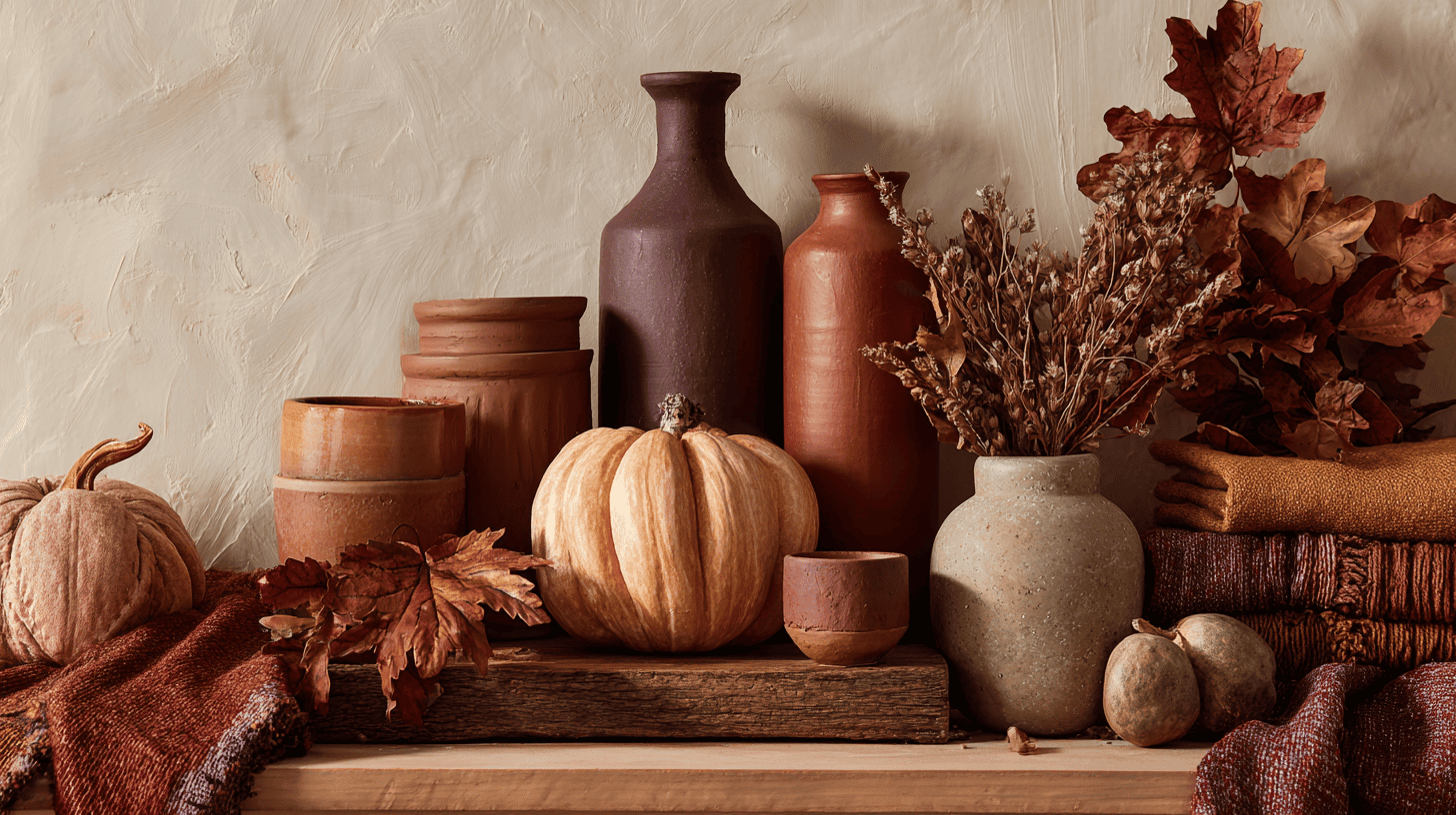
Fall color schemes bring the cozy warmth of autumn right into your home and creative projects. These rich oranges, deep reds, golden yellows, and earthy browns create inviting spaces that feel seasonal and comfortable.
From decorating your living room to crafting DIY wreaths, using the right fall colors makes everything feel more connected to the beauty outside your windows.
Learning how to pick and combine these autumn hues helps you design spaces that look pulled together and feel genuinely welcoming. Ready to fill your home with the colors of fall? Here’s everything you need to know.
What Are Fall Color Schemes and How to Use Them?
Fall color schemes capture the warm, cozy tones we see in autumn leaves and landscapes. These palettes typically feature rich oranges, deep reds, golden yellows, and earthy browns, bringing seasonal comfort to any space.
You can apply these colors in countless ways throughout your daily life. Use burnt orange and mustard yellow in your living room through throw pillows and blankets.
Create fashion looks with rust-colored sweaters paired with olive green pants. Plan weddings or parties using burgundy and copper accents in table settings and decorations.
The key is mixing darker, muted shades with pops of brighter autumn hues to create balance and visual interest.
Trending Fall Color Palettes You’ll Love
These popular combinations mix classic autumn tones with fresh, modern twists. Here are some of the most-loved fall color schemes that work beautifully for any design or decor project.
1. Amber Hearth
Amber Hearth brings together the glow of a crackling fire and the gentle feel of early autumn. Pastel orange and copper blend with mocha brown, muted clay, and soft cream to create a calm, grounded mood.
The mix works well for settings that aim to feel welcoming, adding a sense of comfort through familiar fall tones without overwhelming the surrounding space.
- Color Palette: #FFB547, #C86A34, #6C4A3C, #B67859, #F4EDDF
- Usage: Ideal for home accents, seasonal packaging, and knitwear.
2. Apple Barn
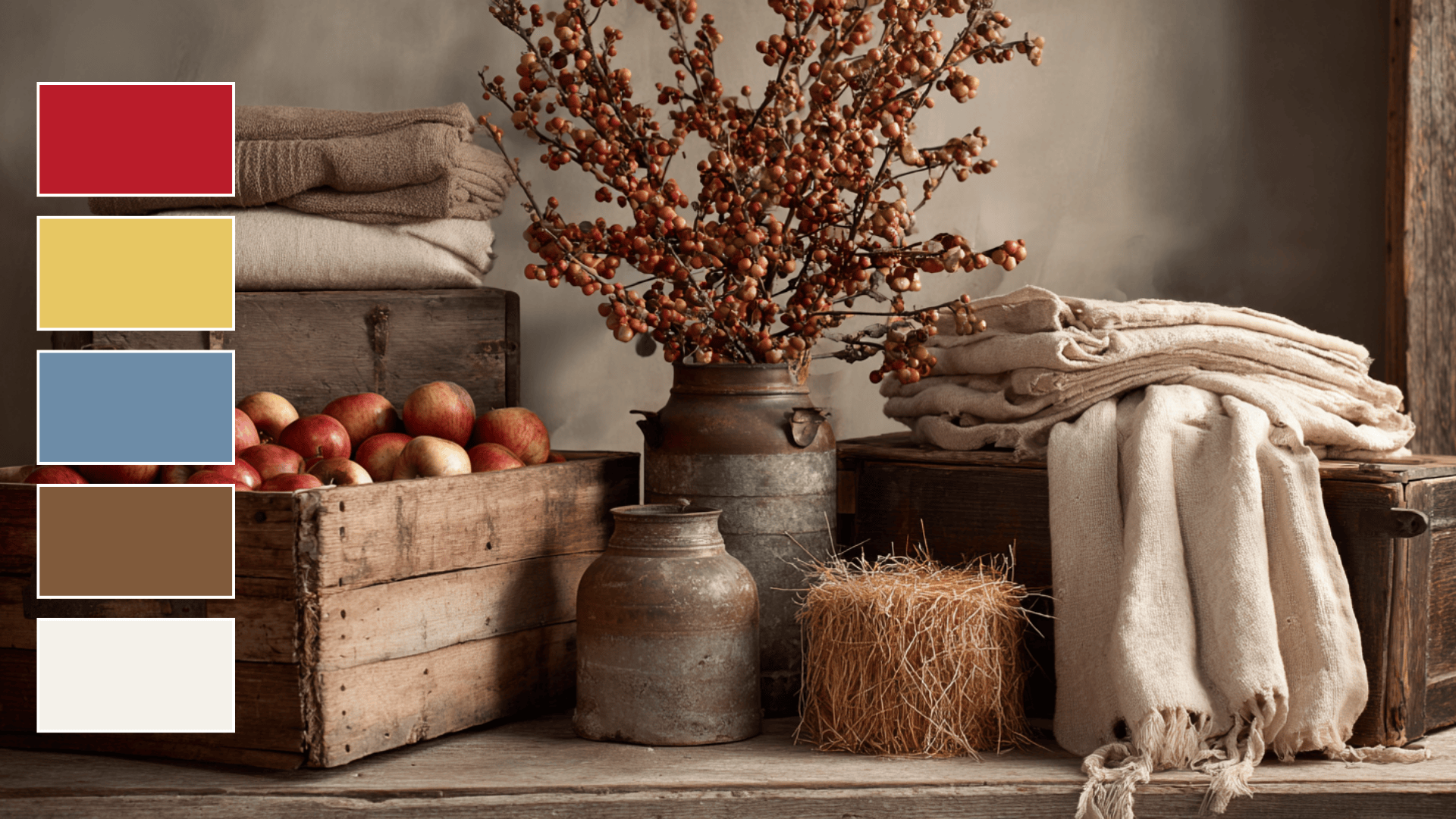
Apple Barn reflects the charm of harvest season with orchard red, straw gold, faded denim, raw wood brown, and gentle ivory.
The palette captures the feel of quiet country moments, evoking warmth and familiarity. These tones work well in settings that benefit from a rustic touch, adding character inspired by barns, orchards, and simple autumn days.
- Color Palette: #BA1B2A, #E7C763, #6D8CA6, #805A3B, #F3F1EA
- Usage: Great for farmhouse decor, fall markets, and rustic branding.
3. Harvest Dawn
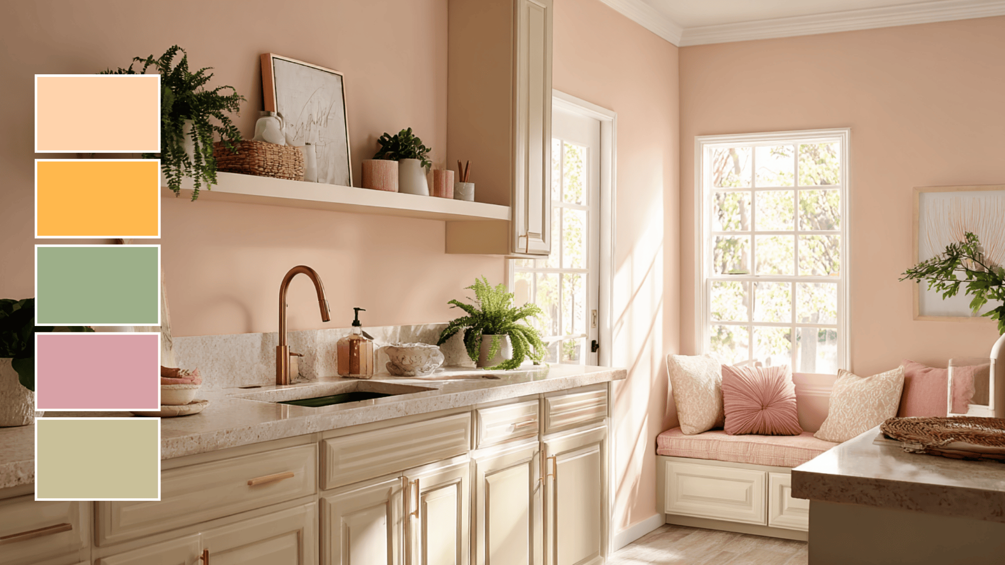
Harvest Dawn brings together soft, warm colors like soft peach and pastel orange, creating a fresh, inviting, and peaceful atmosphere that feels cozy and calming.
Sage green and dusty rose add a calming touch, while light taupe balances the palette with a neutral tone. This color scheme works well in kitchens or dining areas, offering a cozy, welcoming feel that’s perfect for autumn.
- Color Palette: #FFD3AC, #FFB84D, #B2AC88, #D8A1A7, #B38B6D
- Usage: Perfect for creating a fresh, uplifting vibe in kitchens, dining areas, and for seasonal decorations.
4. Frosted Mulberry
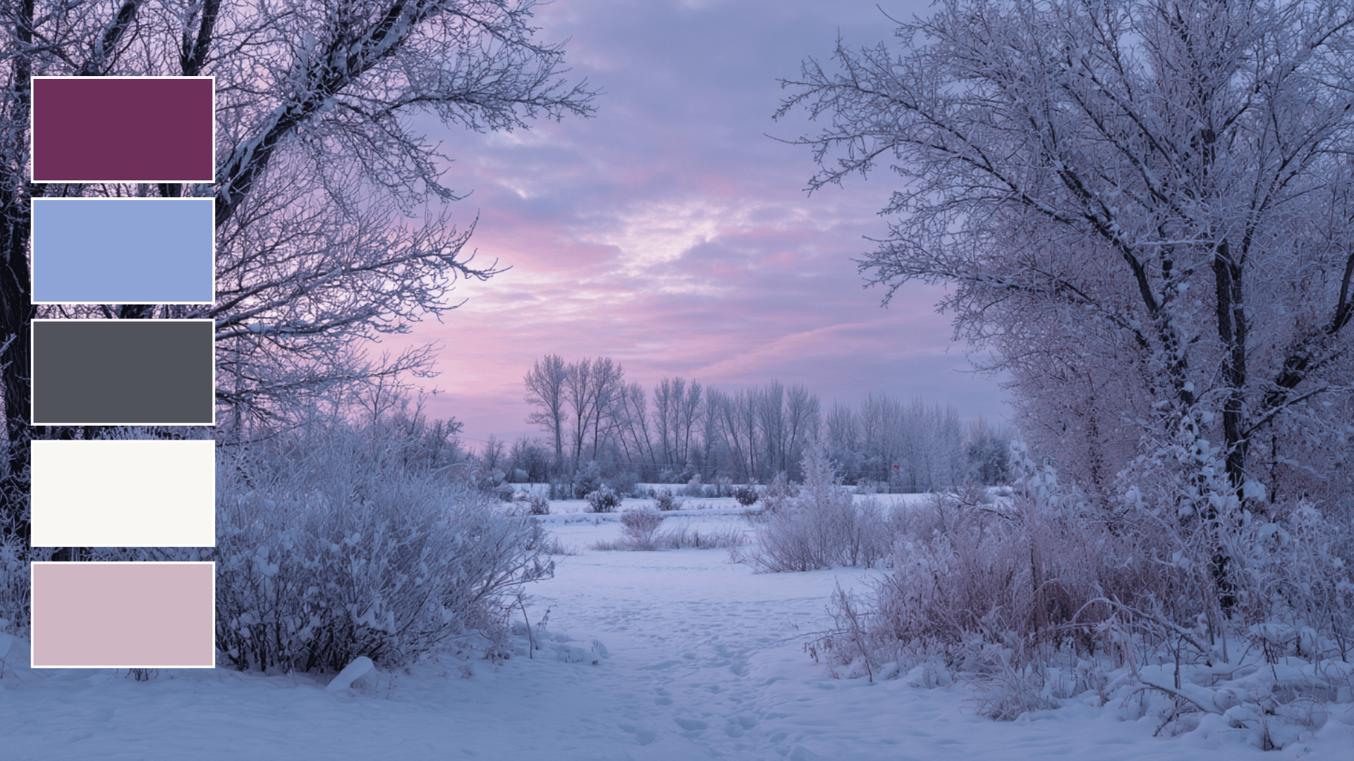
Frosted Mulberry blends the cool feel of early frost with rich berry-inspired tones. Mulberry purple, soft periwinkle, muted charcoal, frost white, and pale rose work together to create a palette that feels calm, gentle, and seasonally fitting.
These shades offer a quiet sense of comfort, making them suitable for designs that call for a refined, cool-weather atmosphere.
- Color Palette: #6E2F5B, #8EA3D6, #50535A, #F8F7F4, #CFB6C3
- Usage: Ideal for evening events, refined branding, and stationery design.
5. Pinecone Trail
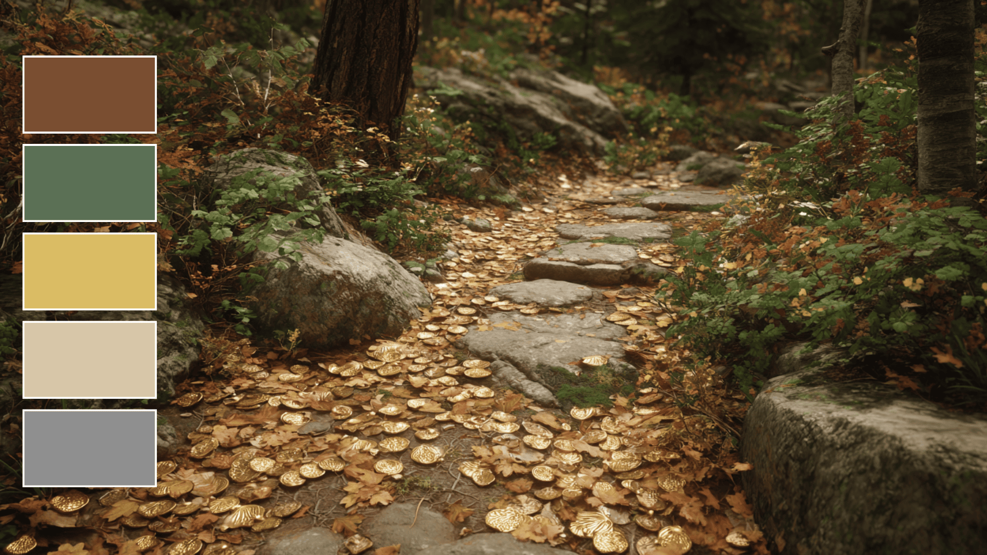
Pinecone Trail takes its cue from forest paths scattered with pinecones and late-season foliage. Warm brown, muted cedar green, brushed gold, pale tan, and stone gray combine to form a grounded, nature-focused palette.
These hues bring a sense of calm and earthiness, making them well-suited for designs that highlight the outdoors or aim to reflect a warm, rustic atmosphere.
- Color Palette: #7A4E32, #5B7055, #DABC64, #D7C6A8, #8F8F8F
- Usage: Ideal for outdoor brands, fall trail themes, and natural product packaging.
6. Pumpkin Patch Glow
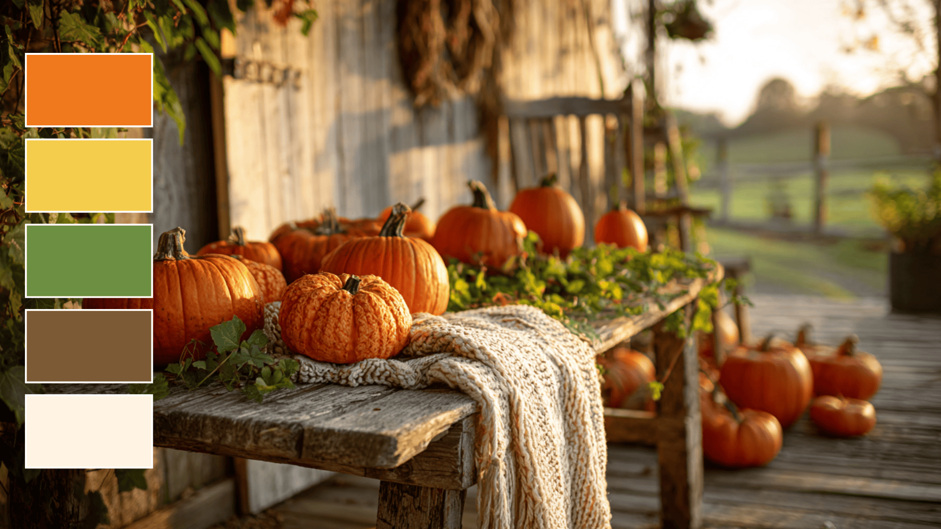
Pumpkin Patch Glow brings together pumpkin orange, squash yellow, vine green, barnwood brown, and warm cream to create a cheerful fall atmosphere. The mix of bright and earthy tones adds warmth and playfulness without feeling overwhelming.
This palette captures the look of farm stands, carved pumpkins, and family gatherings, giving designs a friendly, seasonal feel suited to lively autumn themes.
- Color Palette: #F0791C, #F5CC4C, #6D8F41, #7C5A36, #FFF4E3
- Usage: Ideal for kids’ decor, seasonal event designs, and festive branding.
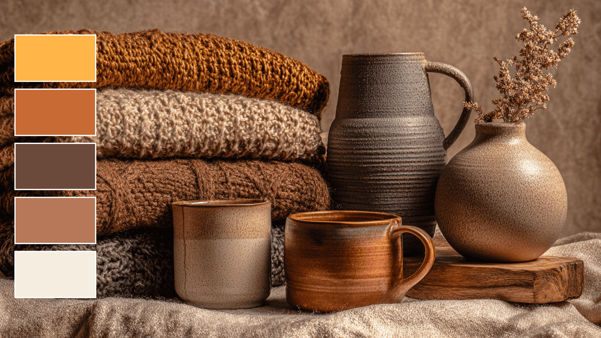
7. Smoky Maple
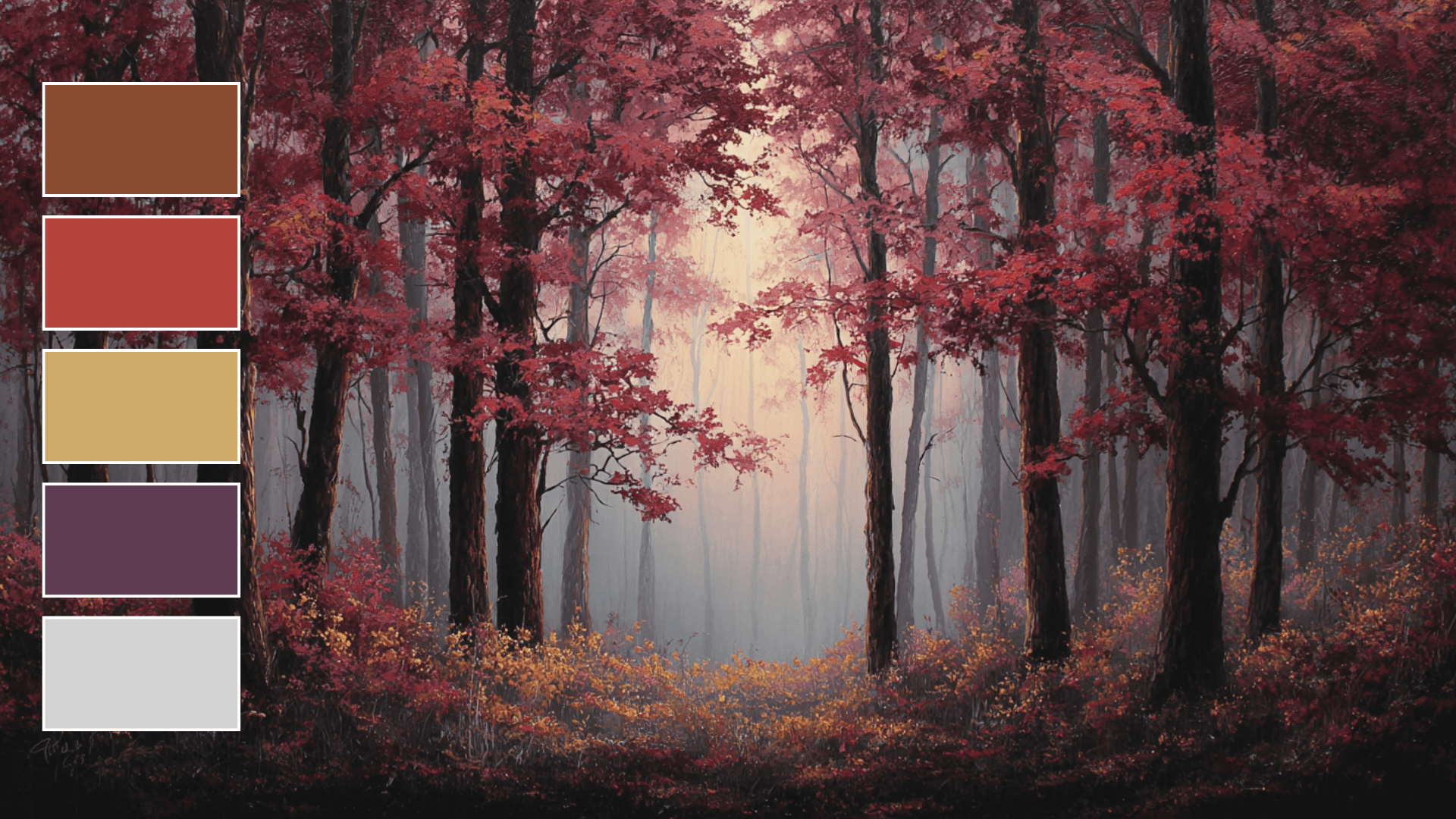
Smoky Maple blends smoky browns, maple red, dusty gold, twilight plum, and cloud gray to create a palette with depth and character. The combination of warm, muted tones creates a grounded, moody feeling that suits thoughtful, expressive visuals.
This scheme works well in projects aiming for a quiet atmosphere with rich seasonal influence, especially where a calm yet impactful setting is needed.
- Color Palette: #8A4A2F, #B6433E, #CDAA67, #5E3B54, #D3D3D3
- Usage: Best for fashion lookbooks, styled photography, and high-end branding.
8. Whispering Pines
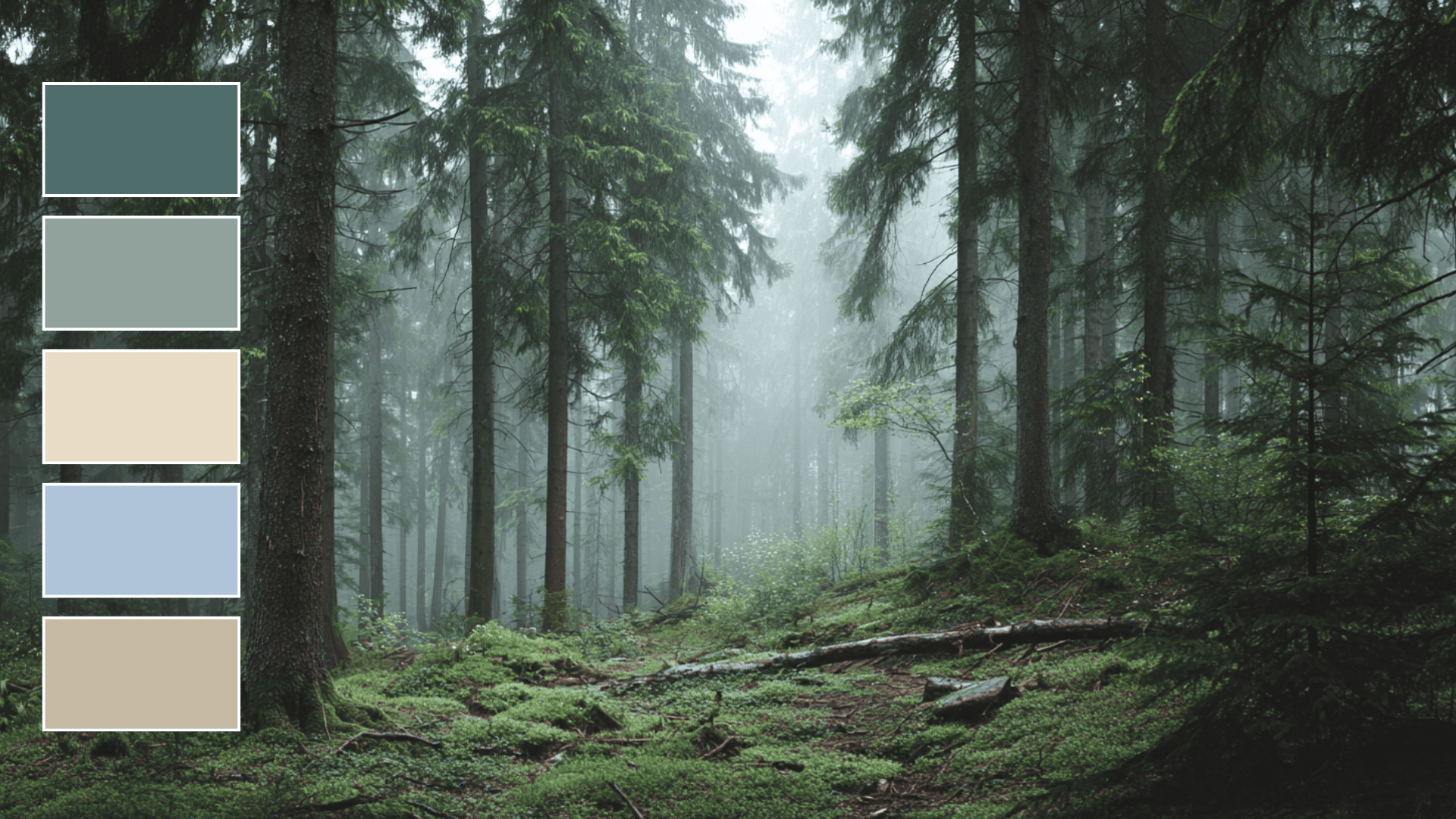
Whispering Pines uses cool pine green, muted green-gray, buttery beige, soft fog blue, and light driftwood to create a peaceful autumn mood. The colors feel gentle and grounded, echoing quiet forest mornings and soft natural light.
This palette suits designs that aim for a calm, distraction-free setting, offering a clean, soothing approach that complements simple, nature-inspired themes.
- Color Palette: #4E6D6A, #8FA29B, #E9DCC7, #AFC4D9, #C5B9A3
- Usage: Perfect for minimalist interiors, wellness branding, and serene product designs
Fall Color Schemes for Personal Projects: Craft, DIY & More
Fall colors bring warmth and nostalgia to handmade projects. These rich, cozy tones help you create pieces that feel seasonal and personal. Working with autumn palettes connects your crafts to nature’s most beautiful time.
1. Custom Art and Paintings
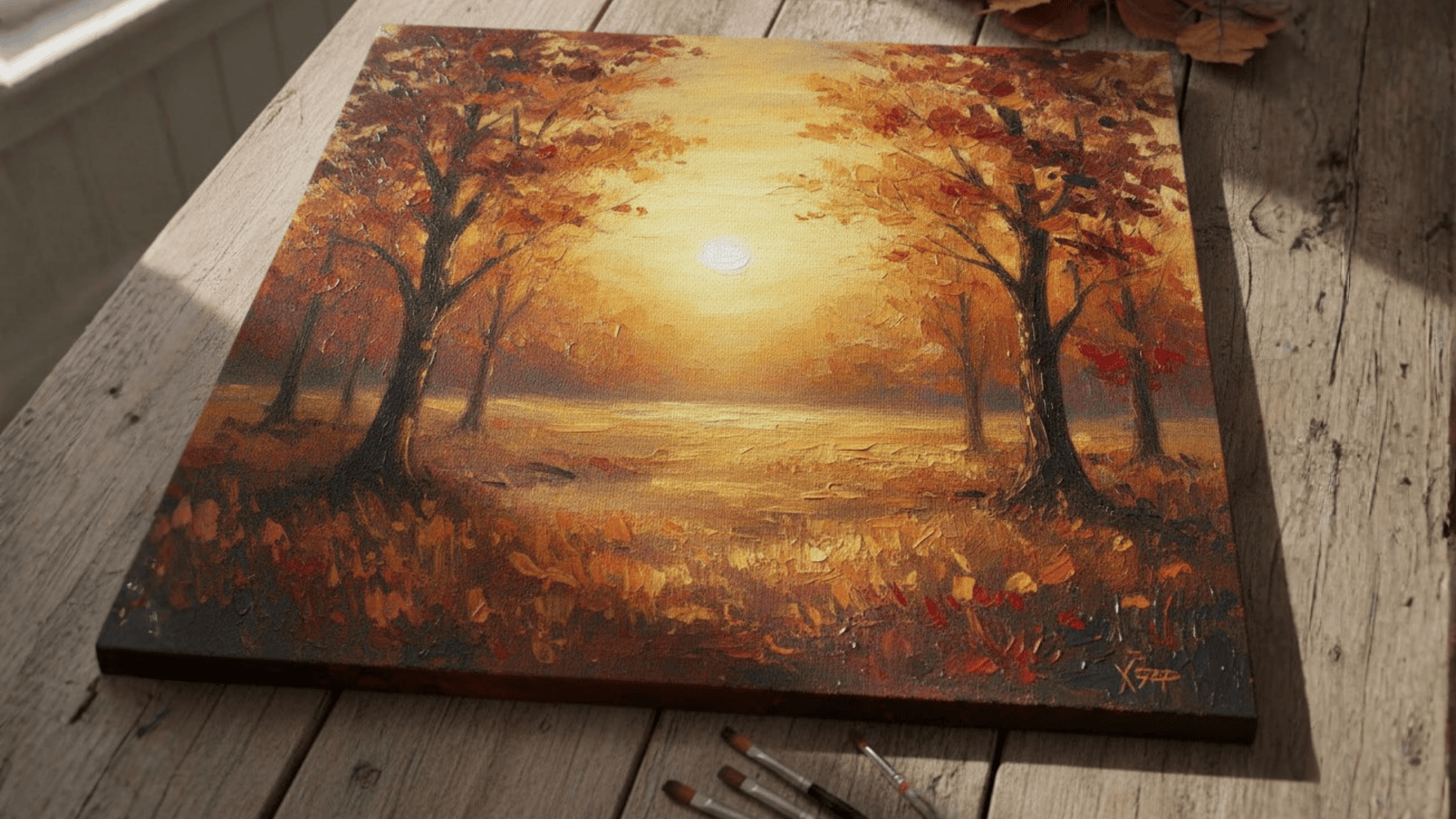
Create canvas art using burnt sienna, amber, and chocolate brown for a cozy autumn feel. Paint abstract leaf patterns or autumn landscapes with layers of rust and gold.
Try blending terracotta with cream for sunset scenes. Add textured brushstrokes in crimson and copper to make your artwork pop. These paintings work beautifully as living room or bedroom decor during the cooler months.
2. DIY Fall Wreaths
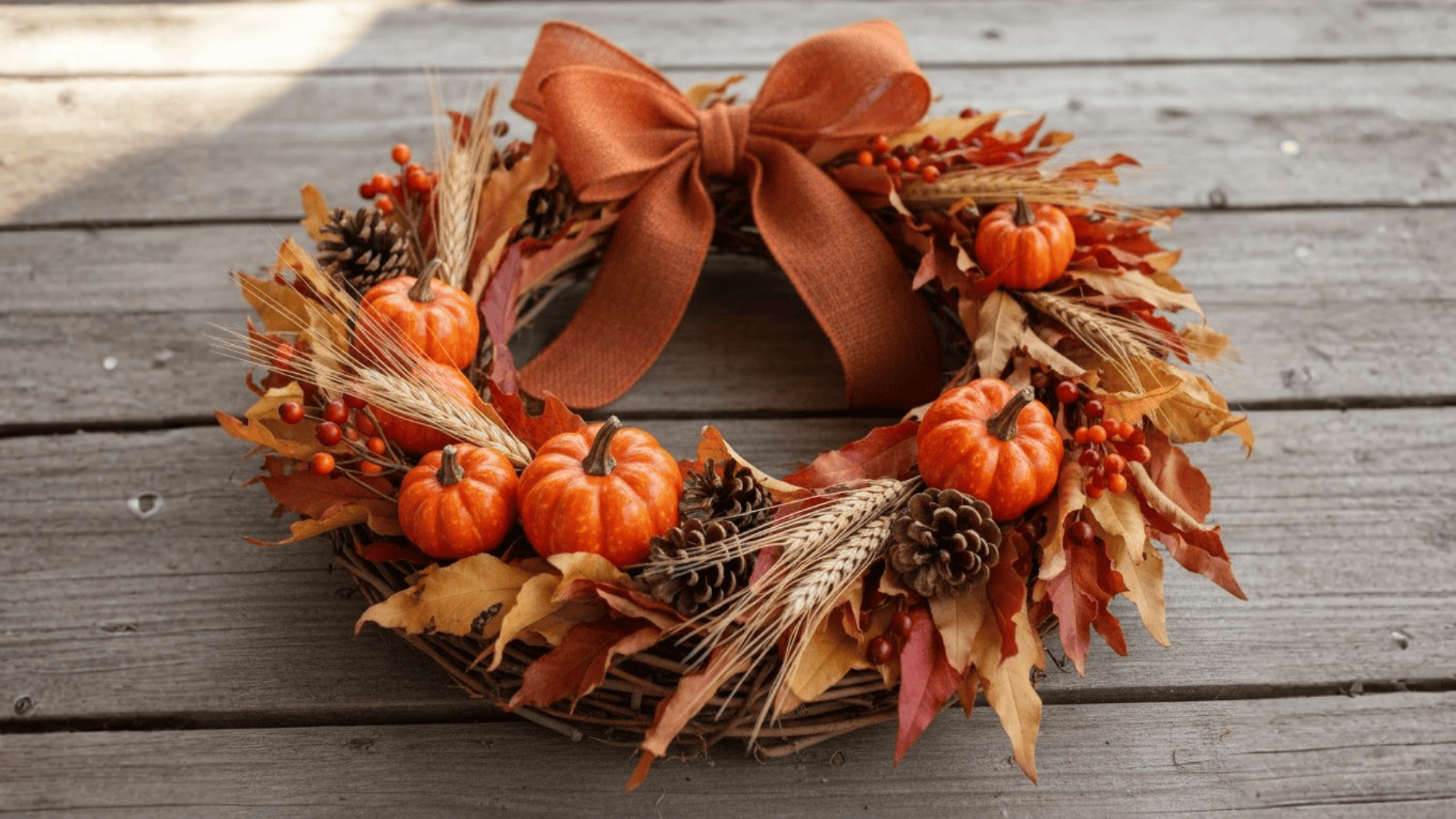
Start with a grapevine or foam base for your wreath foundation. Attach dried leaves in shades of orange, red, and yellow using hot glue or floral wire.
Add mini pumpkins, pinecones, and burlap ribbon in brown tones. Layer different textures, such as wheat stalks and berries, for depth. Finish with a bow in burnt orange or mustard yellow to complete your door decoration.
3. Seasonal Jewelry Making
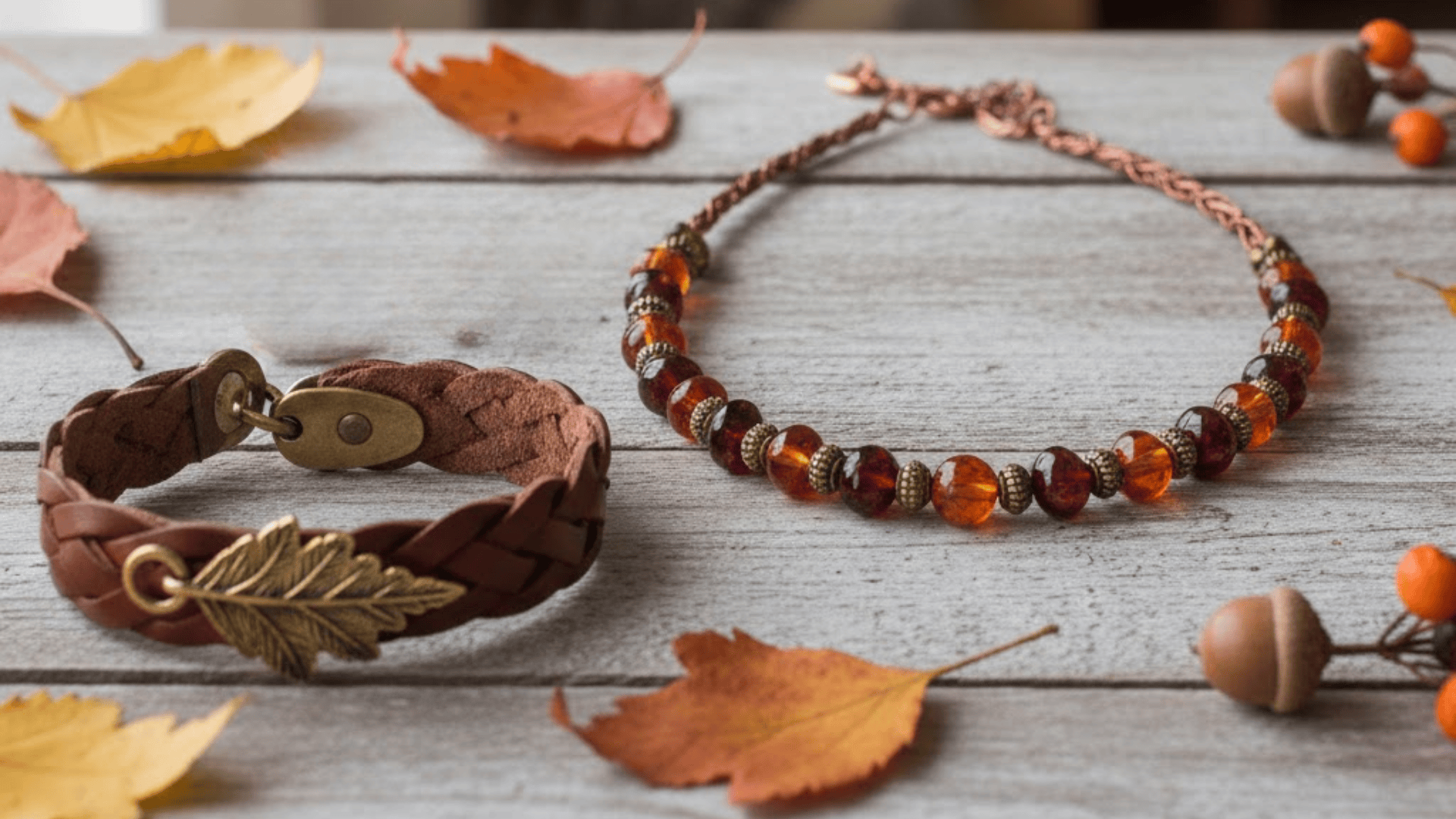
Design necklaces and earrings using garnet, amber, and bronze beads for autumn-inspired pieces. Combine copper wire with deep red crystals to create statement earrings.
Make bracelets featuring brown leather cord with gold leaf charms. Try resin pendants filled with tiny dried flowers in fall colors. These accessories pair perfectly with sweaters and scarves during the season.
Fall Color Schemes for Design
Color schemes set the mood in any room and help create a sense of seasonal comfort. Fall palettes bring warmth and relaxation to your home through rich, earthy tones. These colors make spaces feel cozy and inviting.
1. Cozy Living Room Designs
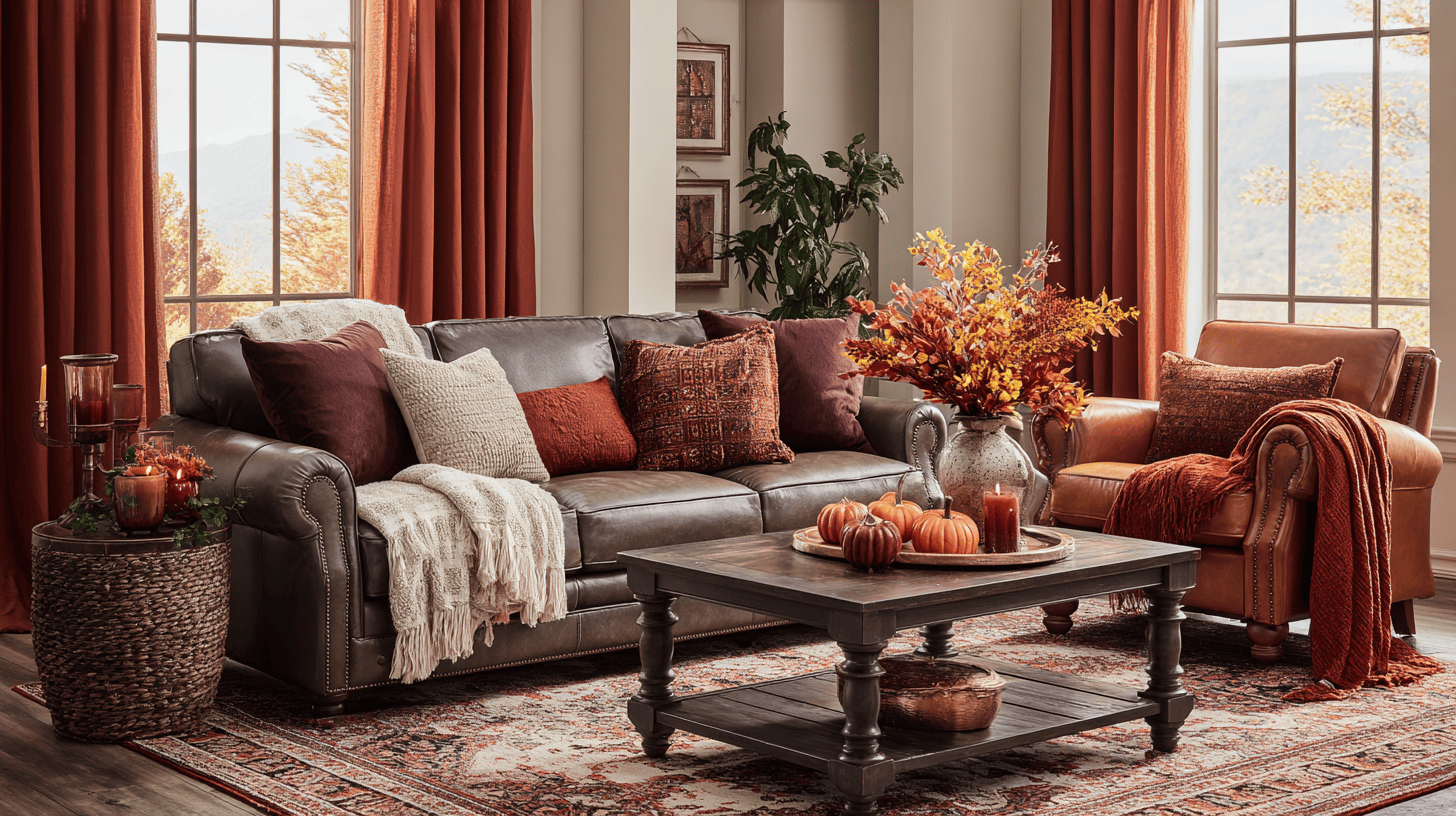
Add burgundy and chocolate brown throw pillows to your sofa for instant autumn appeal. Drape rust-colored blankets over chairs and couches to create a layered sense of comfort.
Choose furniture pieces in caramel or cognac leather for a warm focal point. Swap lighter curtains for deep orange or maroon panels. Place area rugs in pumpkin spice tones under coffee tables to anchor the room and add texture.
2. Fall-Inspired Kitchen Makeovers
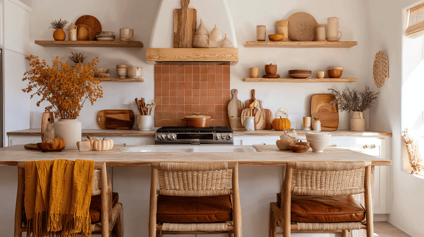
Replace everyday dish towels with ones in mustard yellow and burnt orange patterns. Display ceramic bowls and plates in ochre and rust on open shelving. Add a terracotta-colored backsplash or peel-and-stick tiles behind your stove.
Use wooden cutting boards and copper utensil holders as functional decor. Switch out barstools for ones with warm brown cushions to complete the seasonal look.
3. Autumn Bedrooms for Relaxation
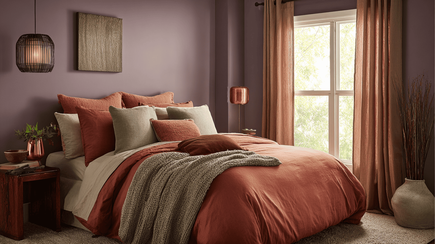
Layer your bed with terracotta duvet covers and sage green accent pillows for a calming retreat. Paint one accent wall in deep plum or eggplant to create depth.
Add soft brown curtains that gently filter afternoon light. Place muted olive throw blankets at the foot of your bed. Use brass or copper lamp bases on nightstands to reflect warm light throughout the space.
Fall Color Palettes for Seasonal Decoration
Seasonal color schemes create instant atmosphere and help your home feel connected to nature outside. Fall palettes make indoor spaces warm and welcoming through carefully chosen decorations.
1. Front Porch & Outdoor Decor
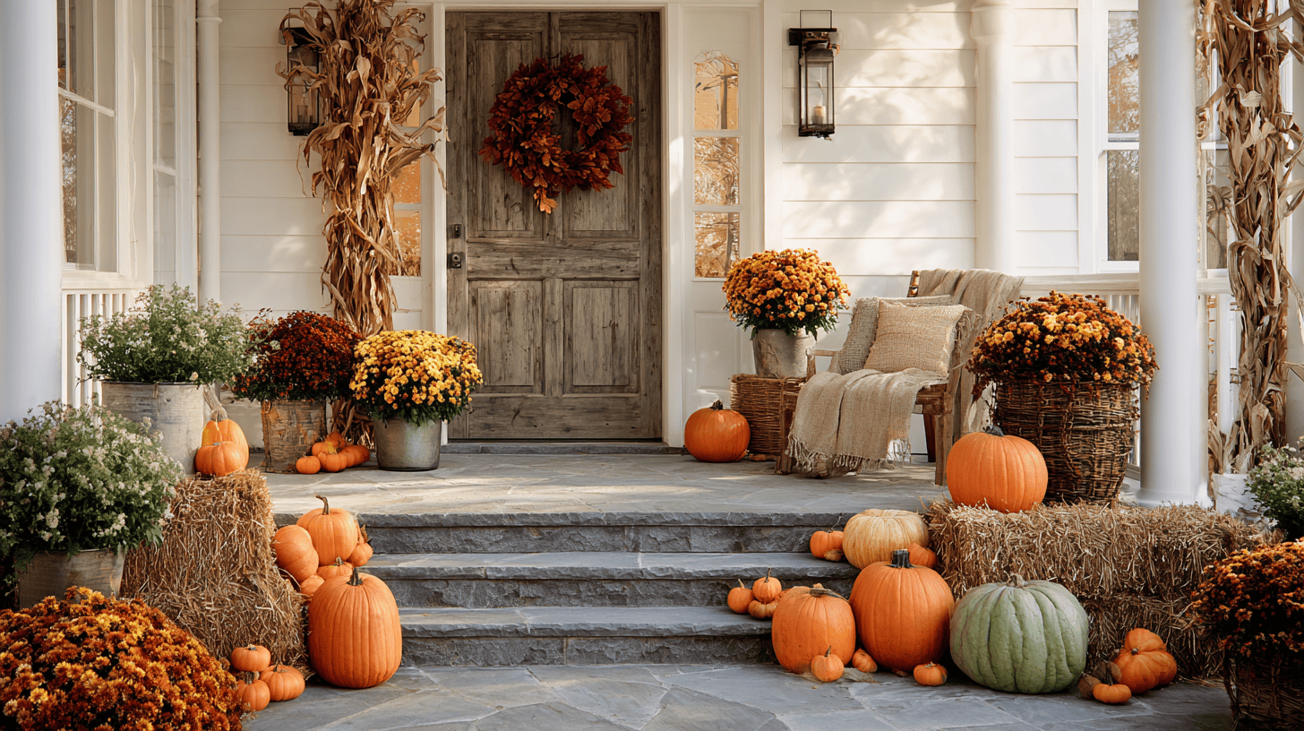
Arrange pumpkins in various sizes and shades of orange across your porch steps and entryway. Hang a wreath made with dried leaves in maroon and rust on your front door.
Plant burnt orange and deep yellow mums in decorative containers by the entrance. Add cornstalks tied with burlap in the corners for height, and set hay bales topped with olive-green gourds to finish the display.
2. Dining Room Table Settings
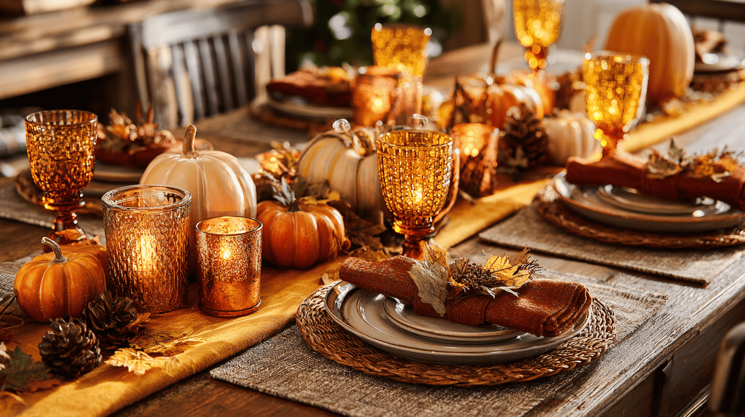
Use a table runner in mustard yellow or burnt orange as your base layer. Set plates on taupe placemats with cranberry-colored napkins folded beside them.
Create centerpieces with pumpkins, pinecones, and cinnamon-scented candles in copper holders. Add fall foliage between settings and use amber glassware to reflect warm candlelight.
3. Fall Lighting & Candle Decor
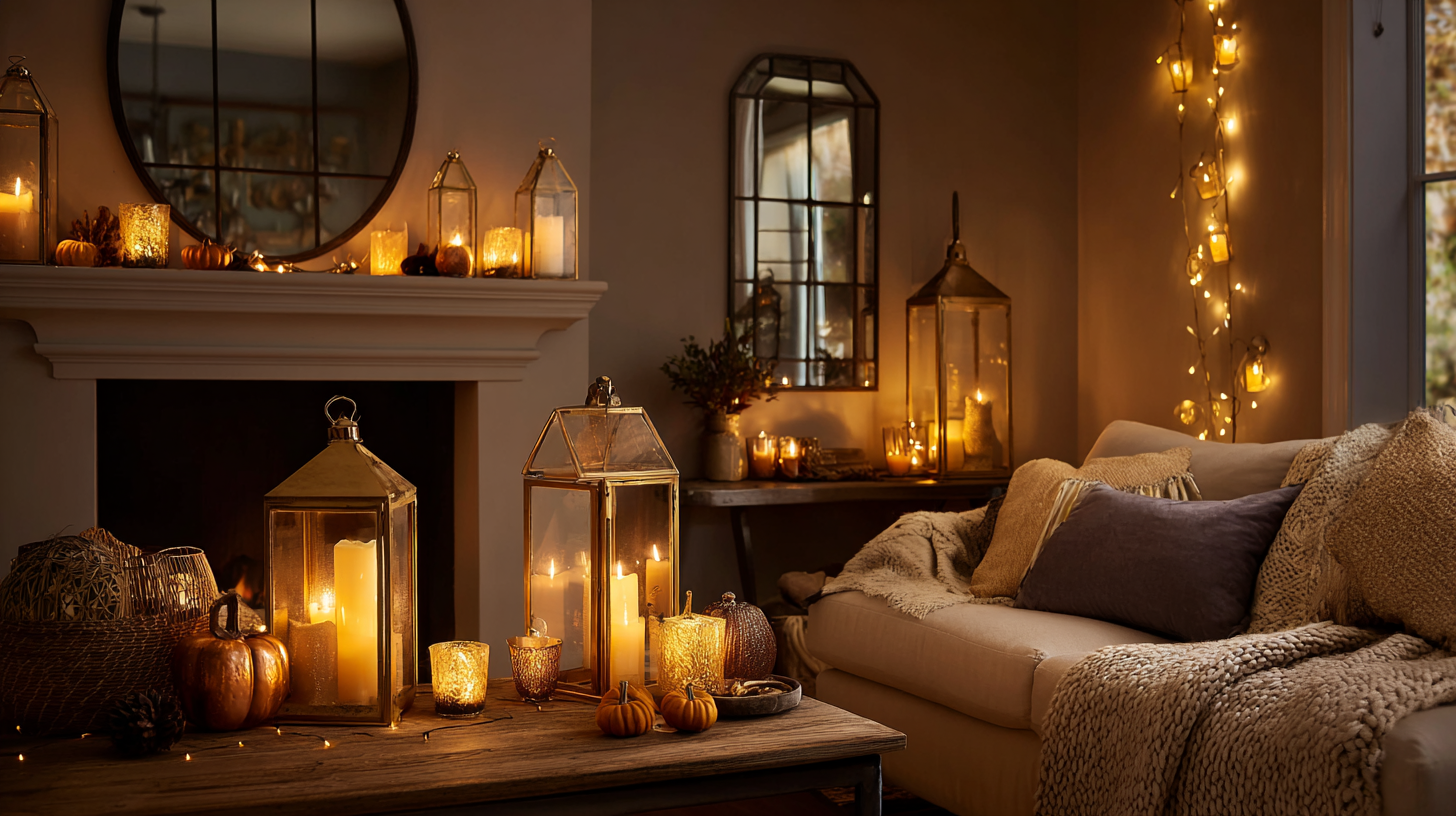
Replace bright white bulbs with warm amber LED lights in table and floor lamps. Group pillar candles in various heights inside golden metal lanterns on mantels and shelves.
Use copper or bronze candle holders with cinnamon or pumpkin-spice candles. Wrap orange and yellow string lights around mirrors or picture frames. Place tea lights in amber glass votives for a soft, flickering glow.
How to Choose the Right Fall Color Scheme?
Choosing the right fall color scheme depends on your space’s natural lighting and intended purpose. Rooms with lots of sunlight can handle deeper shades like burgundy and chocolate brown without feeling dark.
Spaces with limited windows work better with lighter autumn tones like mustard yellow and burnt orange to keep them bright. Consider the mood you want to create.
Warm reds and oranges feel energetic and social, perfect for kitchens and living rooms. Muted browns and olive greens create calm, peaceful feelings ideal for bedrooms. Think about your existing furniture and decor, too.
Pick two or three fall colors that complement what you already own for a cohesive, balanced look.
Fall Color Scheme Mistakes to Avoid
Even beautiful fall colors can look messy when used incorrectly. Knowing common mistakes helps you create spaces that feel balanced and intentional.
- Too Many Colors: Stick to three or four main fall shades to avoid visual chaos.
- Clashing Bright Tones: Don’t pair bright orange with bright red, as they compete for attention.
- Missing Neutrals: Add cream, beige, or gray to give your eyes rest between darker autumn colors.
- All Dark Shades: Include lighter accents to prevent spaces from feeling heavy or smaller.
- Perfect Matching: Avoid matching everything exactly; it looks forced rather than natural.
Remember that balance makes the biggest difference in your design. Mix warm fall tones with cool neutrals, and pair bold colors with softer shades. This approach creates harmony and lets each color shine.
Wrapping It Up
Fall color schemes offer endless ways to bring seasonal beauty into your daily life.
By choosing the right combination of warm oranges, deep reds, and earthy browns, you create spaces that feel cozy and inviting all autumn long.
Remember to balance bold colors with neutrals, avoid using too many shades at once, and let natural lighting guide your choices.
Start small with throw pillows or candles, then build your palette from there. What’s your favorite way to use fall colors in your home?
Share your ideas and projects in the comments below – I’d love to hear how you’re decorating this season!


